


Busmiete.ch - Bus Booking Platform
Helping Users Quickly Find, Compare, and Book the Right Bus for Their Needs
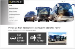
Home - Befor
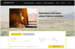
Home - After
My Role
UX Design, User Research, Usability Testing
The Team
4x UX/UI Design Students, 1x Mentor
Time Line
1 Week
Tools
Figma, Miro, Adobe Illustrator, Chat GPT
Deliverables
Competitor Analysis, Expert Review, Personas, Information Architecture, Site Map, User Flows, Prototyping (Low to Mid Fidelity), Usability Testing
The Spark
As part of a one-week Usability & UX course project, our team of four UX/UI design students analyzed Busmiete.ch, a Swiss bus rental platform, to uncover usability issues and improve the booking experience. My role covered UX design, user research, and usability testing from initial review to high-fidelity UI.
The Problem
Busmiete.ch’s booking process was confusing, time-consuming, and lacked transparency.
Users struggled to find and compare essential bus details.
Poor navigation left them unsure and disoriented during the booking process, forcing them to backtrack and repeat steps from the beginning—often leading to frustration and abandoned bookings.
The Solution
Our redesign introduced a clearer information architecture, automated search with filters, and a guided, step-by-step booking flow with improved visual hierarchy and consistent UI elements.
Impact: The final prototype offers a 75% faster, more transparent booking journey that builds trust and reduces user friction.
Product Selection - Before
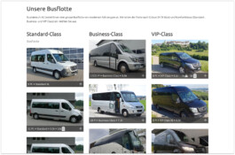
❌ No search & filter – users had to browse the entire fleet manually.
❌ No progress bar or sticky menu – left users disoriented.
❌ No primary action color – weak visual hierarchy.
Product Selection - After
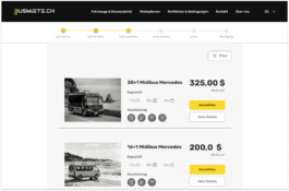
✅ Search & filter tools – instantly find relevant buses.
✅ Progress bar & sticky menu – clear orientation and easy navigation.
✅ Primary CTA color – stronger focus on key actions.
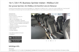
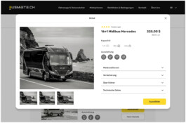
Product Detail - Before
❌ Unstructured text made it hard to find key bus details.
Product Detail - After
✅ Clear hierarchy, icons, and grouped sections make essential info easy to scan.
Understanding the User
Understanding the User
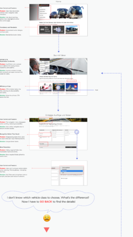
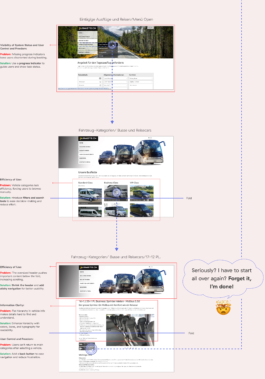
Expert Review: Identifying Usability Barriers
To better understand the usability issues of Busmiete.ch, we conducted an expert review using three key methodologies: Usability Heuristics, Accessibility Evaluation, and a Cognitive Walkthrough.
By evaluating the platform through the lens of a typical user scenario, we aimed to uncover barriers that hinder the user journey and propose actionable improvements.
Task: Book a bus with driver for a group of 20 people with specific amenities.
Understanding the User
Key Hypotheses from the Expert Review
Based on the findings of our Expert Review, we identified the following hypotheses to address key usability issues and improve the platform’s overall user experience.
1. Enhancing Navigation will help users navigate the platform confidently and complete tasks with ease.
2. Improving Information Architecture will streamline decision-making and improve the overall user experience.
Understanding the User
User Interviews and Affinity Map
Building on the findings from the Expert Review, the next step was to analyze user feedback to validate earlier insights and ensure our solutions align with real user needs. Using qualitative data from five user interviews, we organized key observations into an Affinity Map.
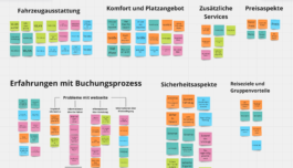
Finding common patterns and pain points using an affinity map
From the Affinity Map, we identified the following recurring pain points that highlight critical challenges faced by users.
Complicated and frustrating search process:
Cumbersome and unclear booking process:
Understanding the User
User Persona
To bring our insights from user research to life and build empathy with our users, we crafted two personas based on our findings. Each persona reflects the frustrations, needs, and aspirations of key user groups.
Meet Günter and Anna, representing users striving for clarity, efficiency, and a stress-free bus booking experience.
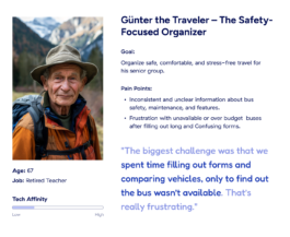
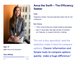
Persona o1
Persona o2
Finding A Solution
Finding A Solution
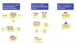
Using insights from user research, we crafted 'How Might We' questions to address key challenges and identify practical solutions. These questions laid the groundwork for brainstorming ideas that address user needs and enhance the overall booking experience:
How Might We ...
... ensure users can easily find and understand the information they need, such as bus features, vehicle conditions, and rental terms?
... ensure that users always know where they are and what to do next throughout the booking process?
... help users intuitively find, fill out, and submit the correct form to successfully complete the booking process?
Finding A Solution
Brainstorming: Generating and Evaluating Solutions
After defining the challenges through the HMW questions, we conducted a structured brainstorming session to generate a wide range of ideas. These ideas were then discussed, grouped (if similar or complementary), and prioritized through a voting process (4, 3, or 2 votes). This allowed us to focus on the most promising and impactful ideas for further exploration.
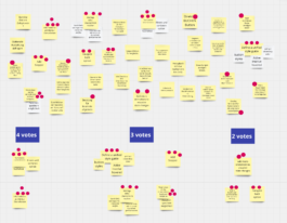
HMW Categorization and Validation
Next, we grouped the prioritized ideas thematically and mapped them to their respective HMW questions. This alignment validated the relevance of each solution and ensured a strong connection between our ideation process and user-centered objectives.
Finding A Solution
Competitive Research
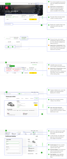
To broaden our perspective and ensure a comprehensive approach, we conducted competitive research to explore how industry leaders address similar challenges. This process helped us uncover best practices, identify gaps, and align our solutions with user expectations and industry standards. Although we analyzed multiple competitors, Europcar.com was chosen as a representative example for this portfolio.
What We Learned from europcar:
Our analysis of Europcar.com validated many of our brainstorming ideas, confirming their alignment with industry best practices. It also offered additional inspiration and highlighted opportunities to further refine and enhance our proposed solutions.
Finding A Solution
From Ideas to Structure: Information Architecture
During user research, we identified challenges in how users find and access information. Building on ideas from brainstorming and competitive research, we designed a clear and user-friendly information structure.
To achieve this, we conducted an open card-sorting session with four participants, carefully observing and analyzing their categorizations to find their’ mental models and preferences for structuring content.
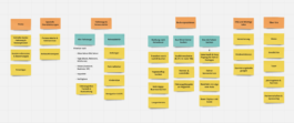
Final structure refined and consolidated from participant card-sorting insights.
These insights guided the final structure, organizing content into primary, secondary, and tertiary levels.
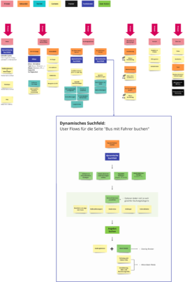
Since both user and competitive research highlighted the dynamic search functionality as a key solution to address user pain points, we chose to spotlight its user flow separately. This demonstrates how the search adapts dynamically across pages, helping users quickly find relevant options tailored to their booking needs.
From Information Architecture to Sitemap
Building on the Information Architecture, the sitemap translates the content structure into a navigation framework. This step ensures a logical flow and user-friendly navigation across all touchpoints.
